LAYOUT & EDITORIAL COMPOSITION
Redefined the visual language of European newsletters by focusing on layout, rhythm, and editorial composition — creating more engaging storytelling formats that elevate small business narratives and strengthen their presence through thoughtful, design-led communication.
PROJECT:
EUROPEAN NEWSLETTERS
CORE SKILLS:
LED CREATIVE DIRECTION
BRAND STRATEGY
SUB-BRAND SYSTEM
CONCEPT DEVELOPMENT
EDITORIAL DESIGN
STORYTELLING
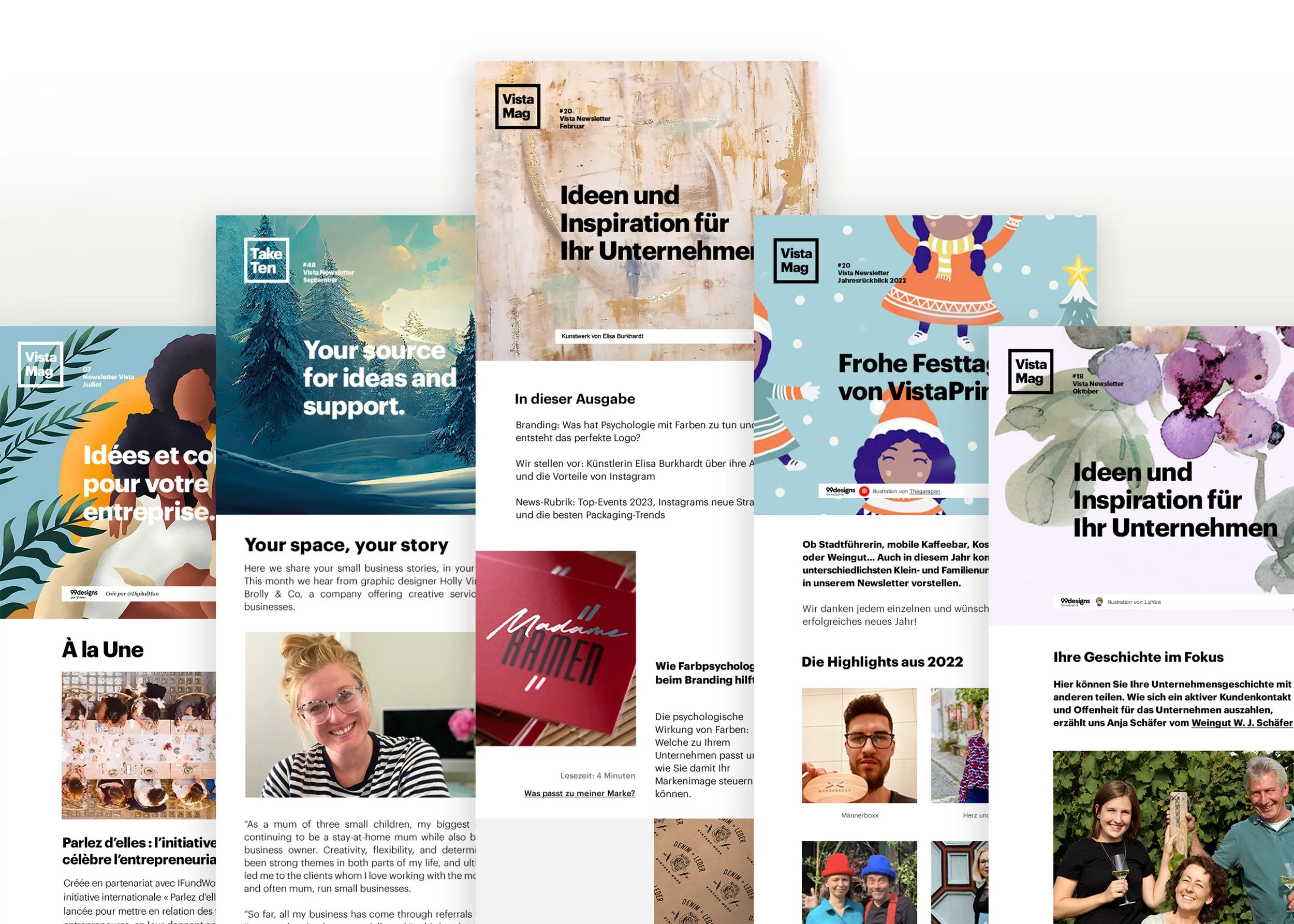
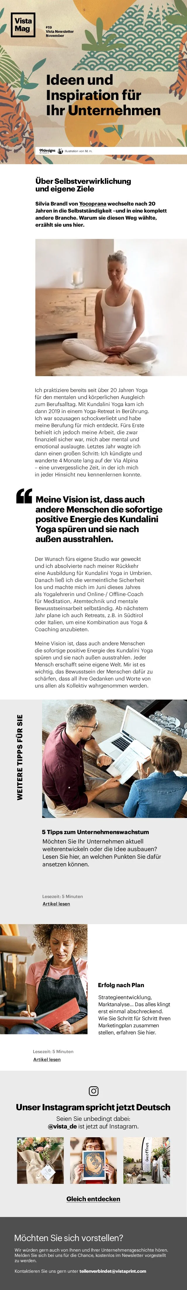
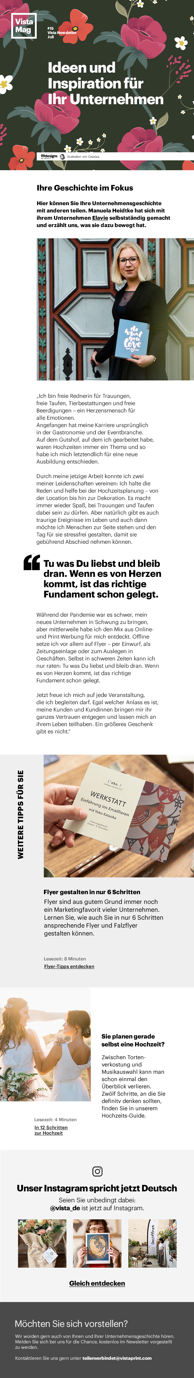
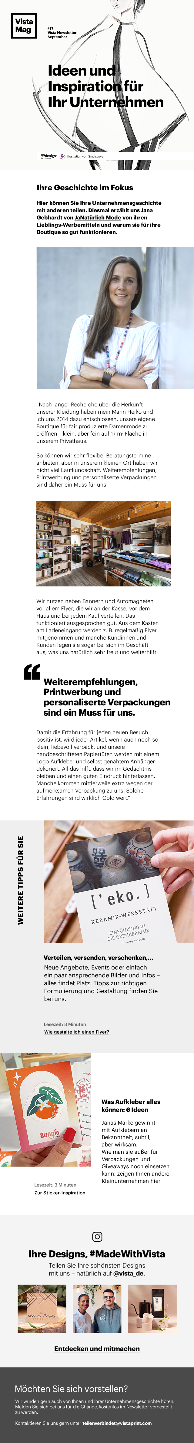
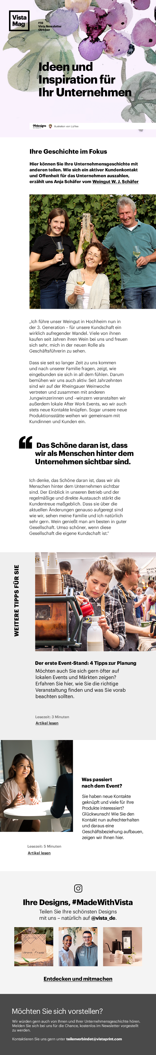
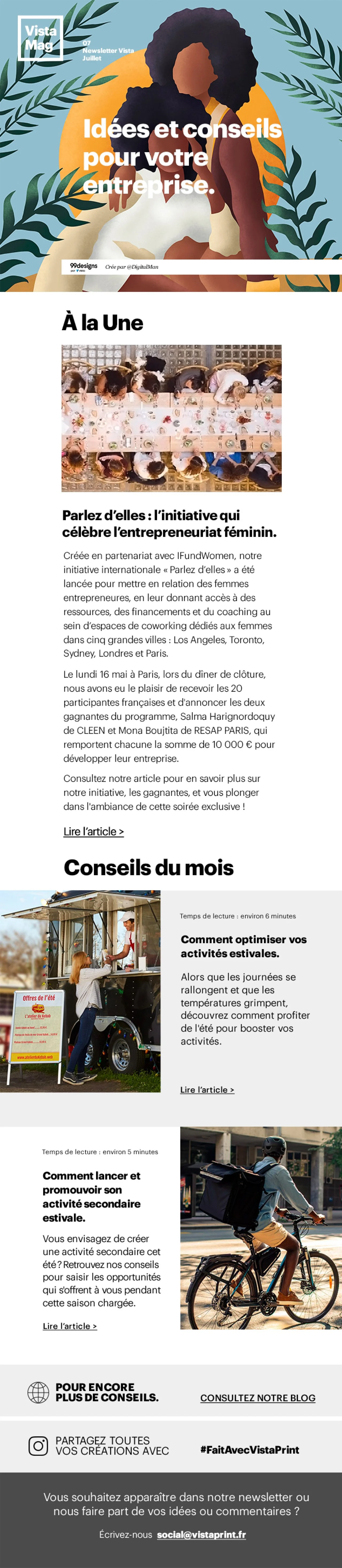
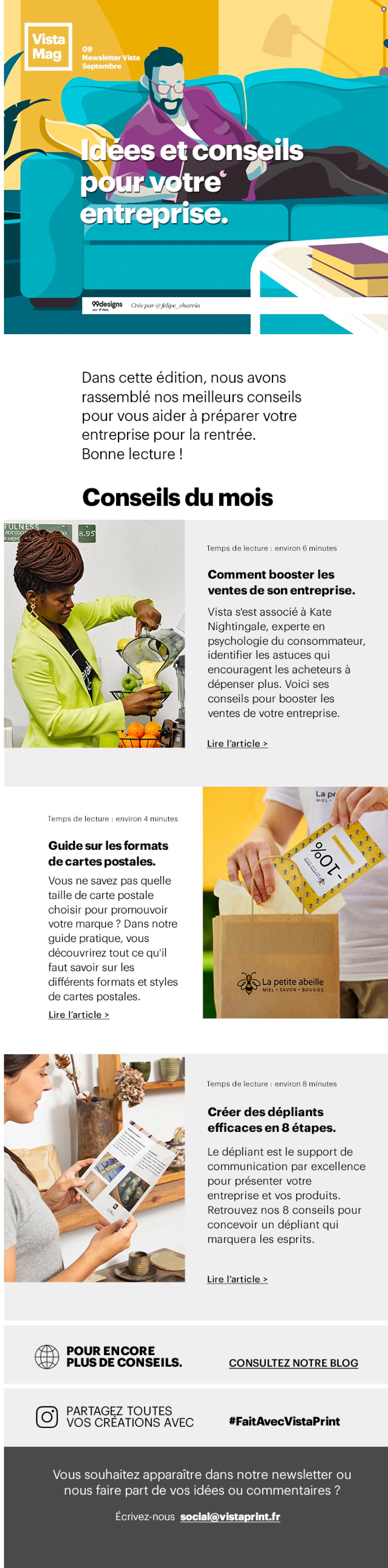
Each European market had its own newsletter style and rationale behind the layout, so in collaboration with the international Creative Director, I created a unified visual framework that balanced editorial storytelling with a consistent brand identity.
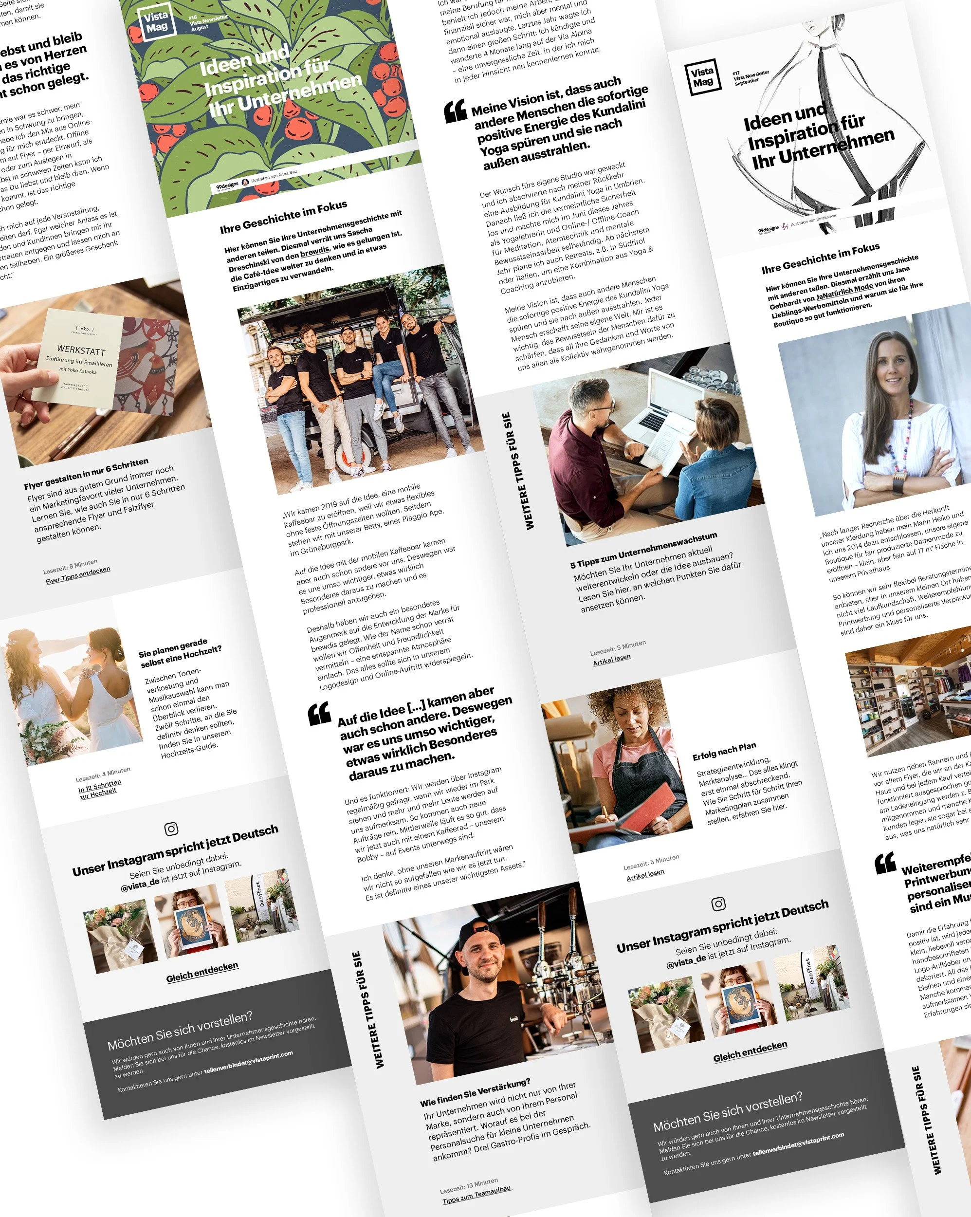
The design uses an editorial grid and consistent visual rhythm to highlight business stories and guide the reader through diverse content while maintaining hierarchy, harmony and design flow.
LEARNINGS
Designing these newsletters taught me that honesty in tone works best when matched with clarity in design — the simpler the structure, the stronger the story.
If you want to see more of my editorial design bits, I’ve got more posted on my Behance — Take a peek when you can!